UI Design — Case Study 02
ProcrastiGreat
A calming iOS productivity app for neurodivergent Gen-Z students.
A UI course brief: design a mobile productivity app for a specific user group. I chose neurodivergent Gen-Z students — a generation increasingly diagnosed with ADHD, autism, and dyslexia, who value planning but find existing apps overwhelming.
How might we help neurodivergent students plan with an app that feels calming instead of stressful?
Secondary research and competitive analysis shaped two design pillars: visual accessibility and feature needs.
Visual Design
- Sans-serif fonts
- Pastel or muted palettes
- Clear visual hierarchy
- Soothing, encouraging visuals
- Accessible contrast ratios
- Readable at all sizes
Feature Needs
- Task chunking & prioritization
- Variety of planning tools
- Habit growth over time
- Planned breaks
- Engagement without overwhelm
- Reframe progress, not failure
Competitive analysis of Streaks, Notion, Toggl, and Apple Notes revealed which features to adapt for this audience.
Research insights were sketched and refined into nine core screens: Login, Home, Kanban To-Do, Notes, Whiteboard, Pomodoro Timer, Habit Tracker, Stats, and Profile.
A moodboard, style guide, and custom icon set defined the aesthetic before any high-fidelity screen was built.
Moodboard
Type & Color
Icon Design
Dashboard & Mock-ups
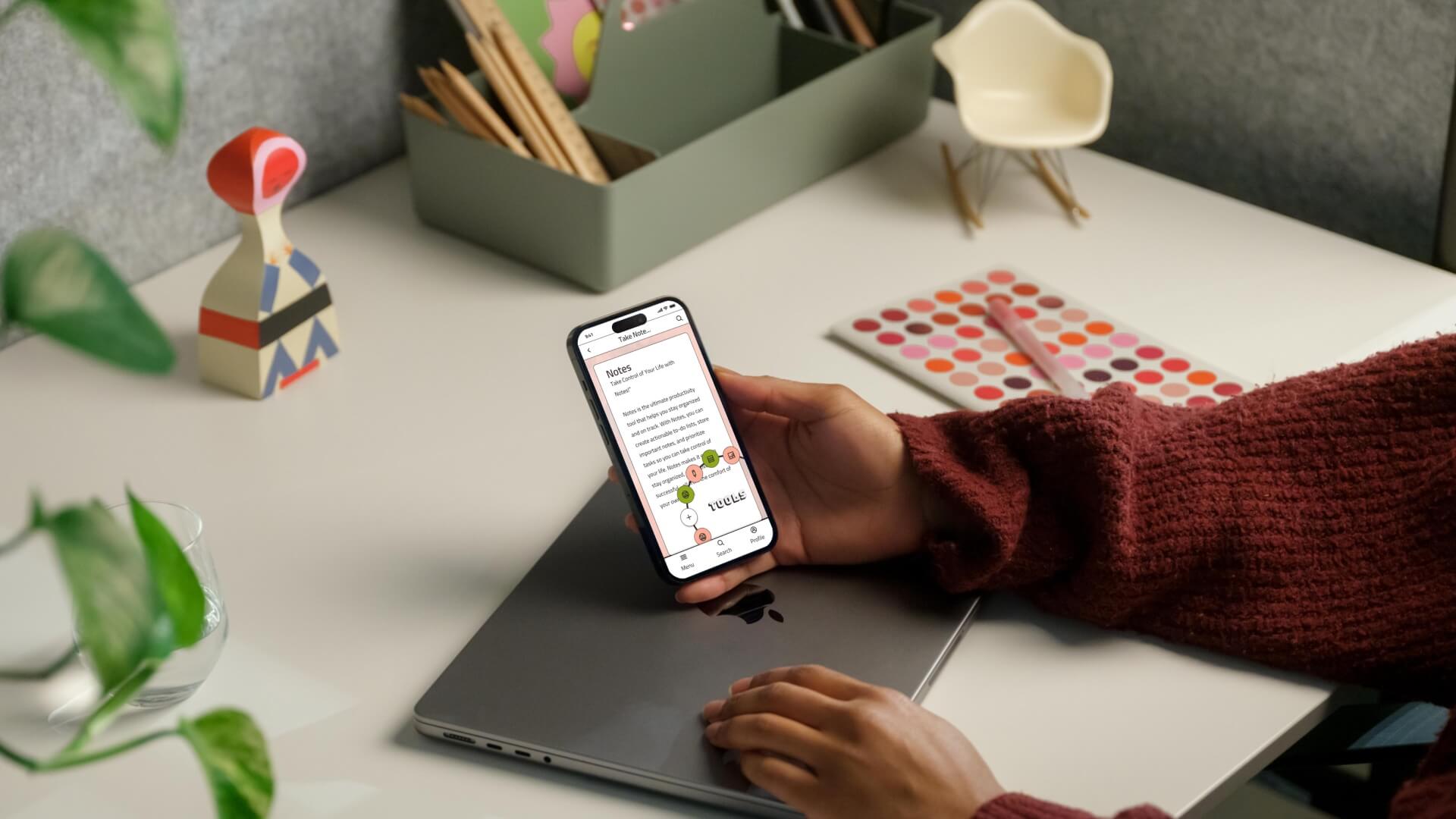
Eight annotated screens — ready for user testing and developer handoff.
- Login / Sign Up
- Home Dashboard
- Kanban To-Do List
- Notes with Hashtag Organization
- Whiteboard
- Pomodoro Timer
- Habit Tracker with custom icons
- Profile & Settings